Dashboard
Your real-time command centre for tracking how your company is performing across the market, media, and social landscape — all in one place.
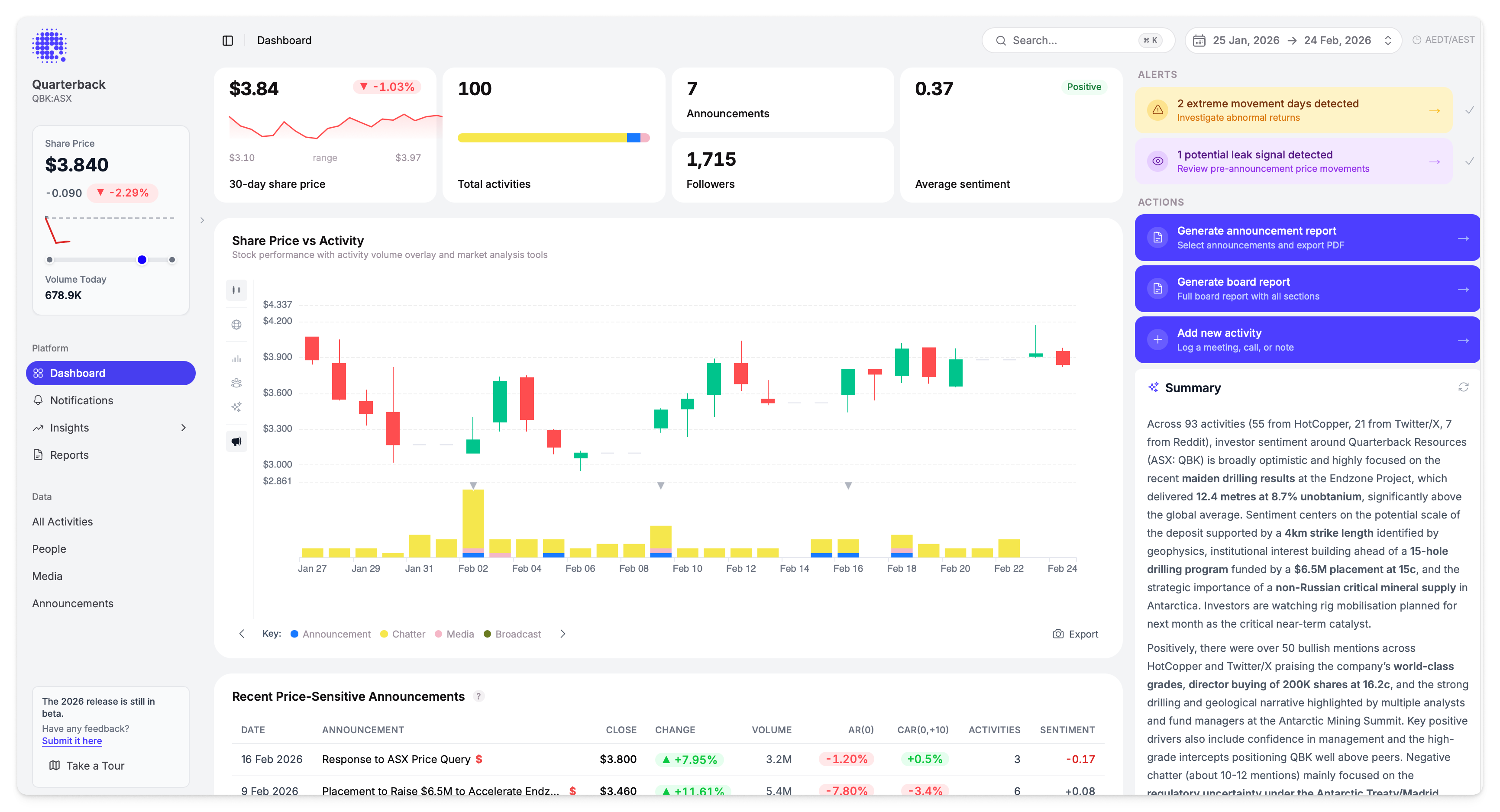
Quick Stats
Four cards across the top give you an at-a-glance snapshot of the selected period:
| Card | What It Shows |
|---|---|
| Share price | Latest close price with period % change, a sparkline chart, and the high/low range |
| Total activities | Total activity count with a coloured bar breaking down by format (Announcements, Chatter, Media, Broadcast) |
| Announcements & Followers | Number of ASX announcements in the period, plus your combined follower count across all connected platforms |
| Average sentiment | Overall sentiment score with a Positive / Neutral / Negative label |
Each card shows percentage change compared to the previous equivalent period where available.
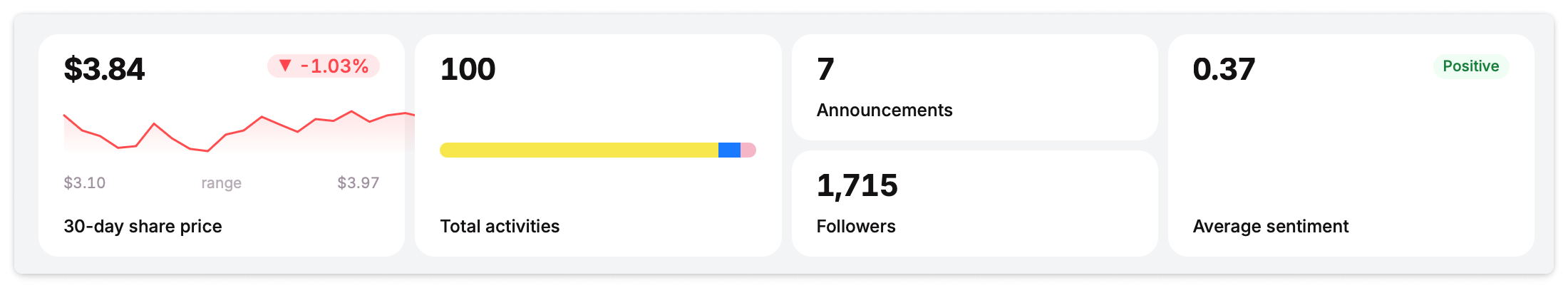
Share Price vs Activity
The main chart overlays share price movement with activity volume, making it easy to spot correlations between what's being said and how the market is responding.
Controls
| Control | Options |
|---|---|
| Group by | Source, Format, or Sentiment — changes how activity bars are colour-coded |
| Time range | 1D, 1W, 1M, 3M, or custom date range via calendar |
| Export | Export chart data |
Overlays
Toggle overlays on or off to layer additional data onto the chart:
| Overlay | What It Shows |
|---|---|
| Volume | Trading volume bars beneath the price line |
| Sentiment | Sentiment trend line across the period |
| Followers | Follower count trend across connected platforms |
| Indexes | Benchmark index performance overlaid on the price chart for direct comparison |
Multiple overlays can be active at the same time.
Click any activity cluster on the chart to navigate directly to those activities.
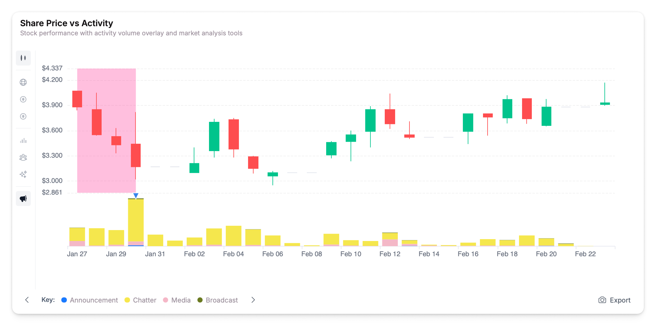
Recent Price-Sensitive Announcements
A table of recent ASX announcements with market impact metrics, shown directly below the share price chart.
| Column | What It Shows |
|---|---|
| Date | Announcement date |
| Announcement | Title with price-sensitive indicator ($) |
| Close | Closing share price on announcement day |
| Change | Price change on announcement day |
| Volume | Trading volume |
| AR(0) | Abnormal return on the announcement day |
| CAR(0,+10) | Cumulative abnormal return over the 10 days following the announcement |
| Activities | Number of related activities |
| Sentiment | Average sentiment score for linked activities |
Click any announcement to open its detail panel with full market metrics and linked activities.
The AR(0) and CAR columns help you quickly gauge whether the market reacted to an announcement and whether that reaction sustained or reversed. See Abnormal Returns for how these are calculated.
Author Activity vs Sentiment
A scatter plot mapping how frequently each author posts against their average sentiment. Bubble size indicates post count — larger bubbles represent more active authors.
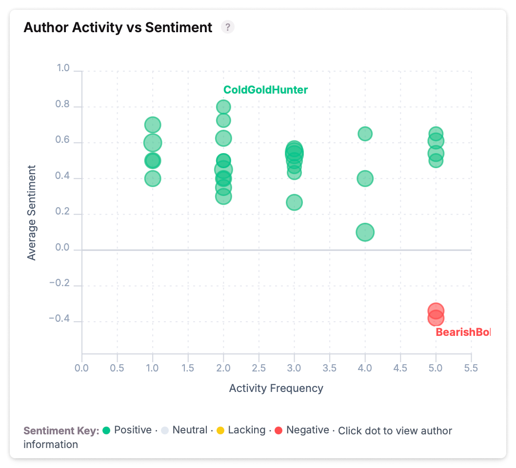
Click any author bubble to open their profile panel with full activity history and sentiment breakdown.
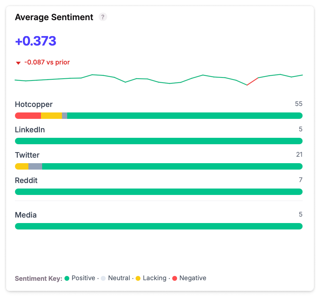
Average Sentiment
Sentiment distribution across all platforms — showing the balance of positive, neutral, and negative sentiment by source (LinkedIn, Twitter/X, Reddit, etc.).
Sidebar
The right-hand sidebar surfaces what needs your attention and provides quick actions.
Alerts
Dynamic alerts that appear when the platform detects something worth investigating:
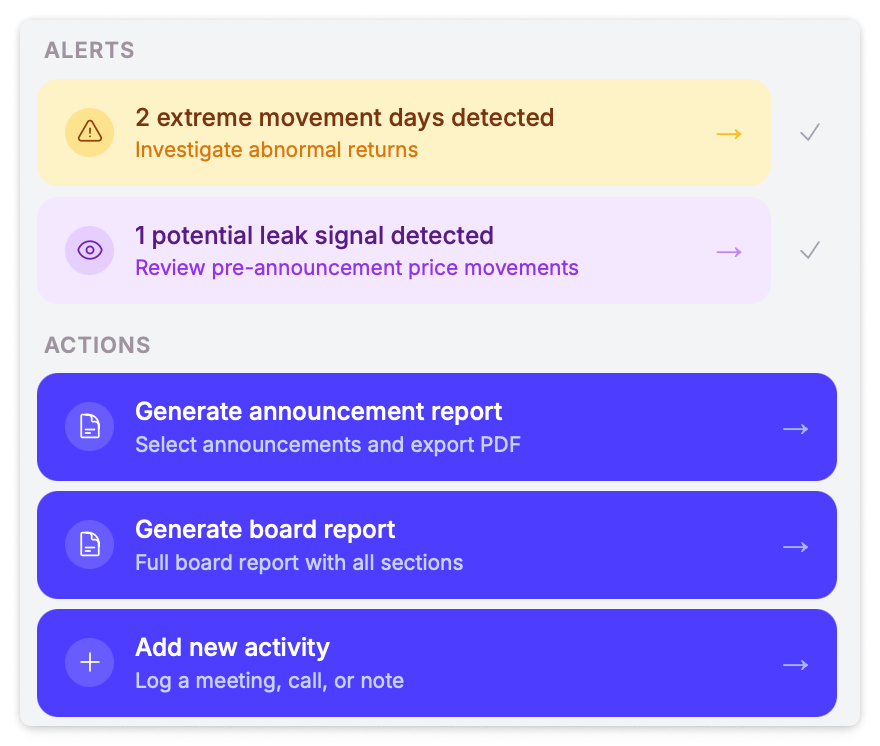
| Alert | When It Appears |
|---|---|
| Extreme movement days | Abnormal return days detected — click to view activities for that date |
| Potential leak signals | Pre-announcement price movements that may indicate information leakage — click to review |
| Negative sentiment | Overall sentiment has dropped below threshold — click to investigate chatter |
Actions
Quick-launch buttons for common tasks:
- Generate announcement report — Select announcements and export a PDF report
- Generate board report — Create a full board report with all sections
- Add new activity — Log a meeting, call, or note
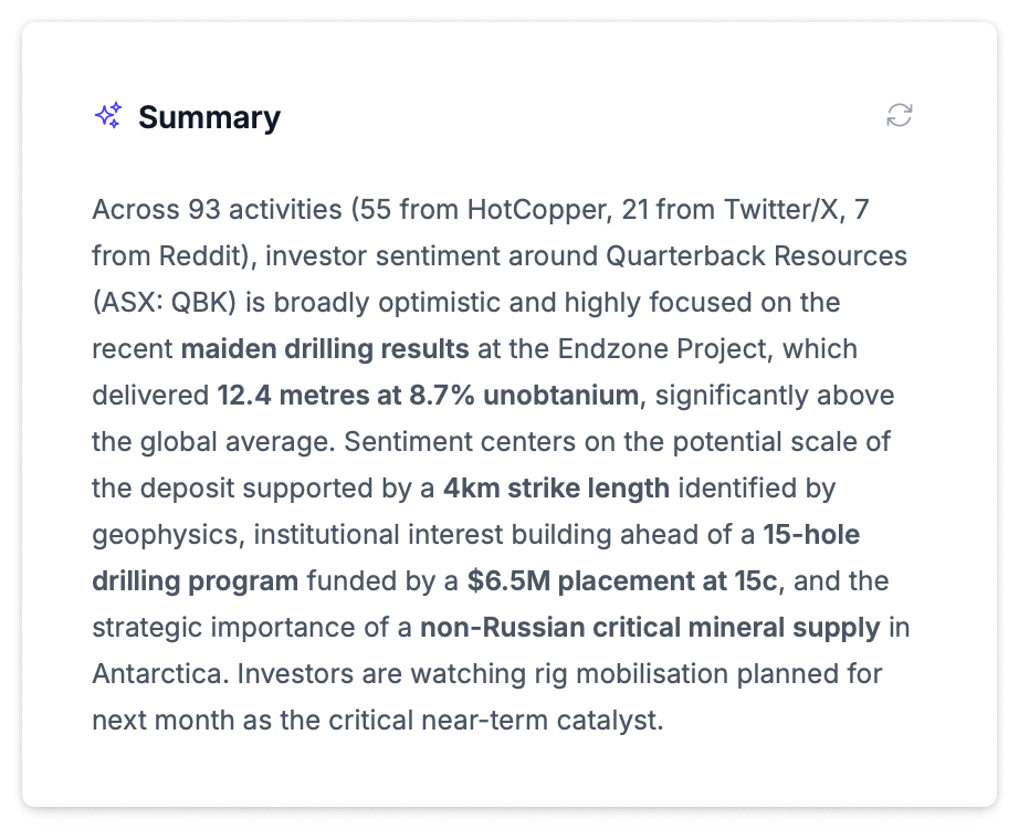
AI Summary
An AI-generated summary of key trends and patterns from the selected period. It highlights notable activity patterns, sentiment shifts, and areas worth investigating. Click any bold term in the summary to search for related activities.
Date Range
The date picker in the top-right header controls all dashboard data. Select from presets or set a custom range. The dashboard enforces a minimum 14-day window and defaults to 30 days. Your preference persists across sessions.